Founder and Lightning:
A design system is a set of standards to manage design at scale by reducing redundancy while creating a shared library and visual consistency across different pages and platforms.
Company: Curation Connect
Role: Product Designer
Year: 2023
UX/UI Methodologies & Techniques:
Specific component UX research
UI design
QA of implementation
Style Guide
UI Inventory
UX Audit
Context
Introduction
Worked with our team to create a consistent design system for our company's platform, serving as a foundation for future projects. This allowed us to reuse existing design system components and platform files, speeding up both design and development. Collaborating closely with a design lead and developers, we used Figma tokens and variables for efficient design handoffs. My role involved turning designs into reusable components, with Figma as the primary design tool
Primary role was UX/UI designer.
The Challenge
- Rebuild old components
- Collect all previous use cases and create new ones for each component

The Benefit
Increased Efficiency: By reusing components and platform files, projects are completed faster, reducing the need to redesign or code elements from scratch.
Consistency Across Projects: A unified design system ensures visual and functional consistency across different projects, improving brand identity and user experience.
Faster Design Handoffs: Using Figma tokens and variables streamlines collaboration between designers and developers, resulting in quicker, more accurate handoffs.
Reduced Errors: Standardized components minimize the risk of inconsistencies and design errors, ensuring quality control across projects.
Scalability: The design system serves as a scalable foundation, making it easier to expand and adapt for future projects without reinventing the wheel.
Cost Savings: Reusing components reduces design and development time, lowering costs associated with repeated work.
Improved Collaboration: Designers and developers work more efficiently together, as they have a shared understanding of the design system and reusable components.
Better Maintenance: A single source of truth for design components simplifies updates, making it easier to maintain and improve the platform over time.
The approach
We started with creating a style guide for the system. Luckily for us this one had already been done. All we needed to do was implement any new changes or elements to the system and link the existing style guide.
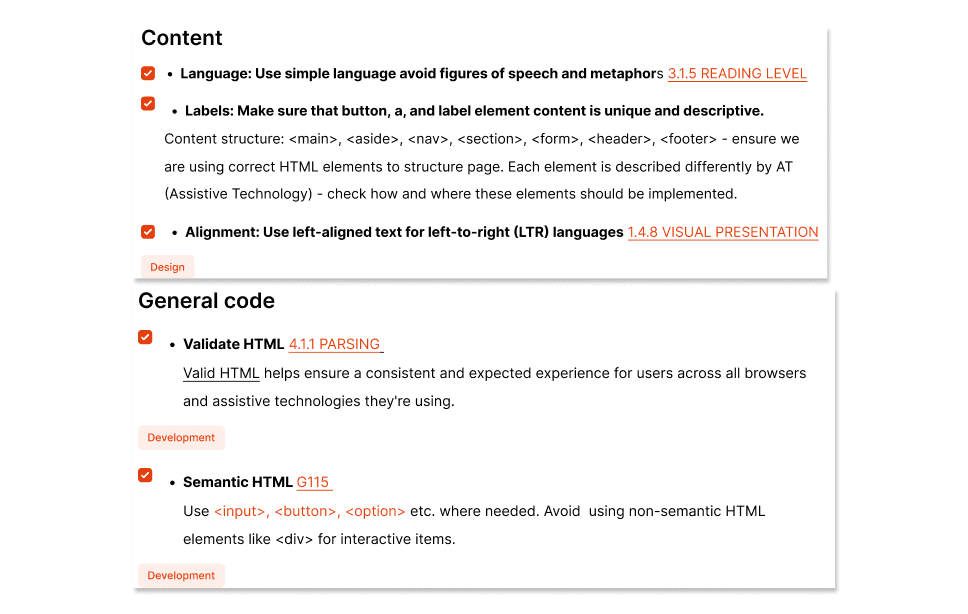
Accessibility Focus
Accessibility Checklist: To ensure that the platform meets industry accessibility standards (like WCAG), we created a comprehensive accessibility checklist. After development, our team of developers reviewed and validated the platform using this checklist, ensuring that all components—such as buttons, forms, and navigation—were accessible to users with disabilities.
Documentation for Designers
Comprehensive "How to Use This File" Guide: To ensure seamless adoption of the design system, I created an in-depth documentation file. The guide includes:
About the Figma Variables Version: An overview of the specific version of Figma Variables used in the design, explaining how they streamline design consistency and efficiency.
Steps to Use Components Without Losing Tokens/Variables: Clear instructions on how to work with the components and maintain the integrity of Figma tokens and variables, ensuring that changes don’t break the design system's structure or functionality.
Design System Foundation: A detailed breakdown of the design principles, typography, color schemes, and spacing rules that form the core of the system, ensuring that all components align with the platform’s visual identity.
Variables Structure: A clear explanation of how the variables are organized, including color, typography, and spacing tokens, and how they should be applied in the design process to maintain consistency.
FAQs: A section that addresses common questions about using the design system, troubleshooting issues, and customizing components without compromising the overall design.
This documentation was essential in ensuring that both designers and developers could easily work with the system while maintaining efficiency, consistency, and scalability.
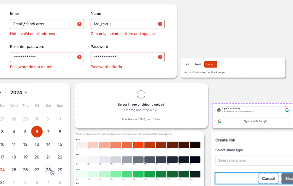
The component library consists of:
Component name:
A specific and unique UI component name, to avoid miscommunication between designers and developers. This needed to be clear so that the components would work as they were supposed to without error.
State changes:
Recommended defaults and the subsequent changes in appearance.
Design specs:
Page annotations and descriptions to understand what component you were looking at.
Variables json:
To quickly provide developers with the latest design updates, we streamlined the process of exporting the JSON file for updated tokens, ensuring seamless integration into the codebase.