Curation Connect:
"Our purpose is to promote companies who do not enjoy the luxury of mega market capitalisations; to give them a voice and a global platform."
Company: Curation Connect
Role: Lead Product Designer
Year: 2024
UX/UI Methodologies & Techniques:
User Interviews & Hotjar Analytics
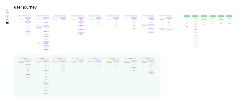
Personas & User Flows
low-fi Wireframing & Prototyping
Usability Testing & A/B Testing
Responsive UI Design & Visual Hierarchy
CRO Techniques (Conversion Rate Optimization)
Context
Introduction
Curation Connect is an investment showcase company that gives a platform to businesses that don’t enjoy the luxury of mega market capitalizations, helping them gain visibility on a global stage. Their goal was to make it easier for investors to discover and invest in emerging companies. However, their existing website—a simple landing page built on a website builder—required significant manual effort to update and lacked the functionality to scale.
The Problem
(Discovery phase)
The main challenges identified during initial user interviews and research were:
Manual Content Updates: The Curation Connect team had no dedicated CMS. They manually - uploaded client showcases (videos, text, and images) via a website builder (Piston / BE + Canva for pics), which was time-consuming (took days) and prone to errors.
Platform is not responsive.
Low User Engagement: Through analytics (Hotjar) and interviews, we discovered that most users (investors, corporate partners, and wholesale users) did not scroll past 30% of the showcase page. The heavy reliance on long-form video content (CEO interviews, business goals, etc.) was a key factor contributing to disengagement.
Trust Issues: Investors expressed difficulty trusting content that was primarily created by the companies themselves, such as CEO interviews. They wanted external validation and insights from third-party experts to make more informed decisions, and needed businesses to be transparent


Research & Insights
To better understand these issues, we conducted two rounds of user interviews. The first round involved speaking with the team responsible for website updates, allowing us to understand their content management struggles.
The second round involved interviews with three key user groups:
wholesale buyers, corporate users, and investors.
In addition, we implemented Hotjar to gather behavioral data. Key insights included:
Manual Processes:The Curation Connect team spent excessive time manually updating content, slowing down their operations.
Video Fatigue: Investors preferred shorter, more digestible content, with 80% of users abandoning showcase videos after the first minute.
Content Trust: Investors expressed skepticism toward company-provided content, calling for external expert opinions and unbiased insights.


These insights led us to three core needs:

A CMS to streamline
content management and
reduce manual work.
A redesigned showcase page
featuring more text-based
content and insights from
experts and investors, with a
better storytelling.
An optimized landing page to
better explain Curation
Connect’s mission and value
proposition.
The Solution
(Build phase)
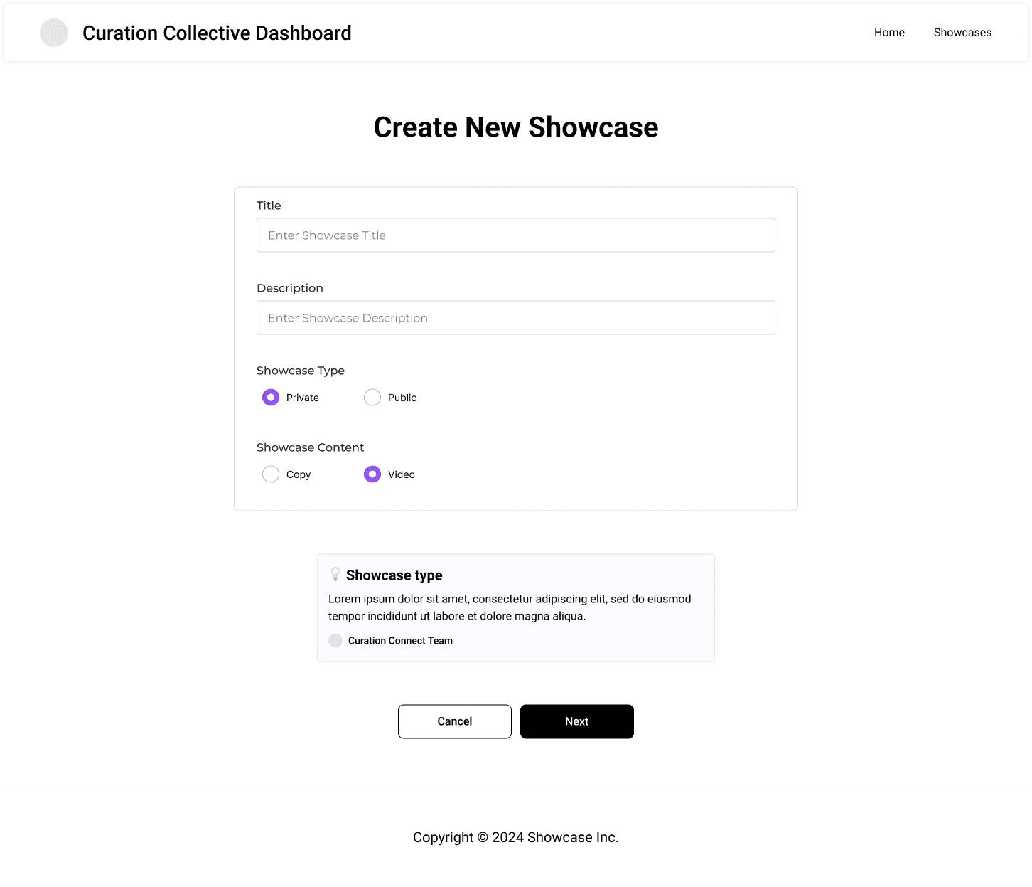
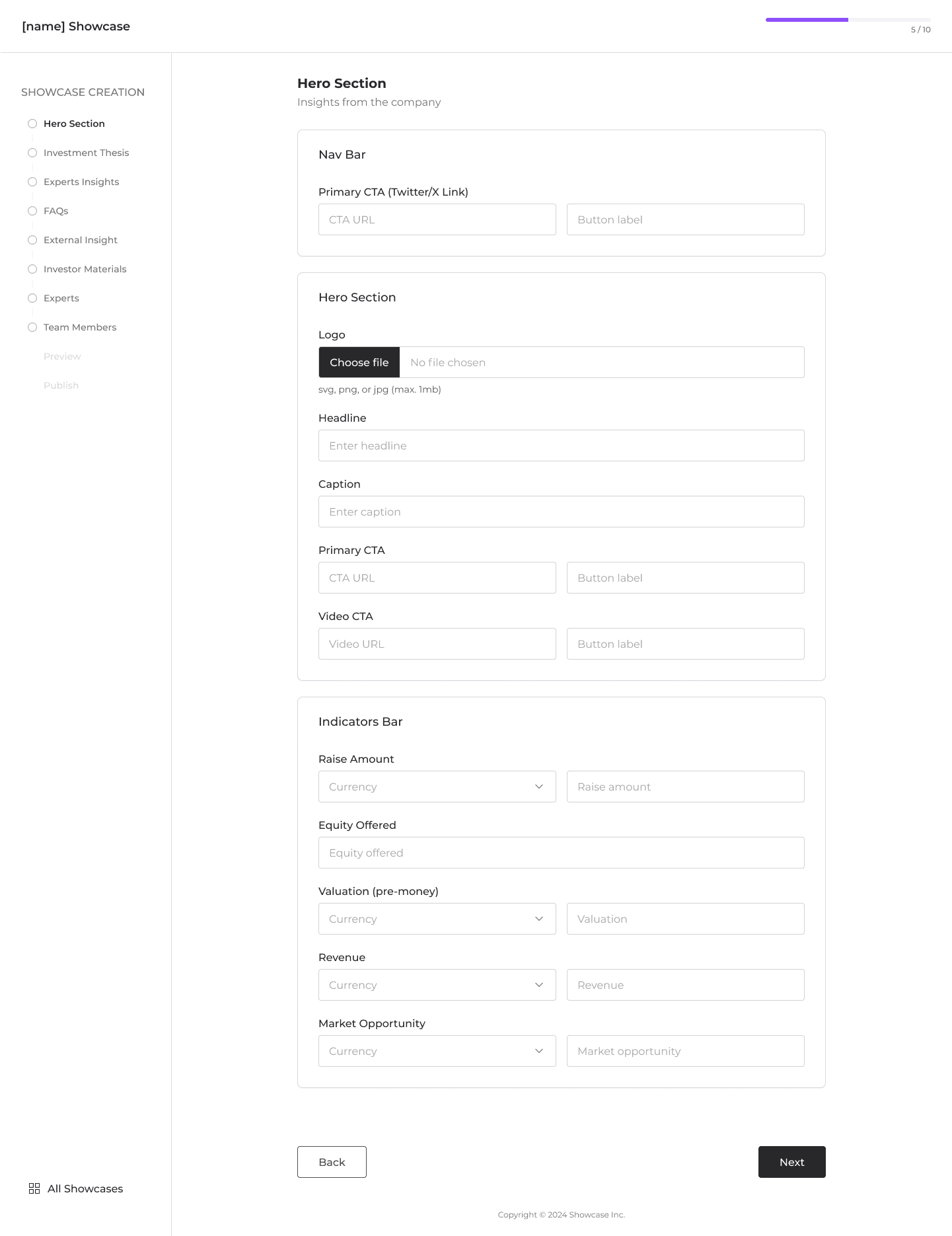
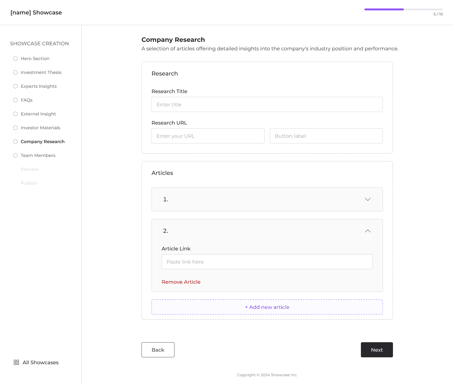
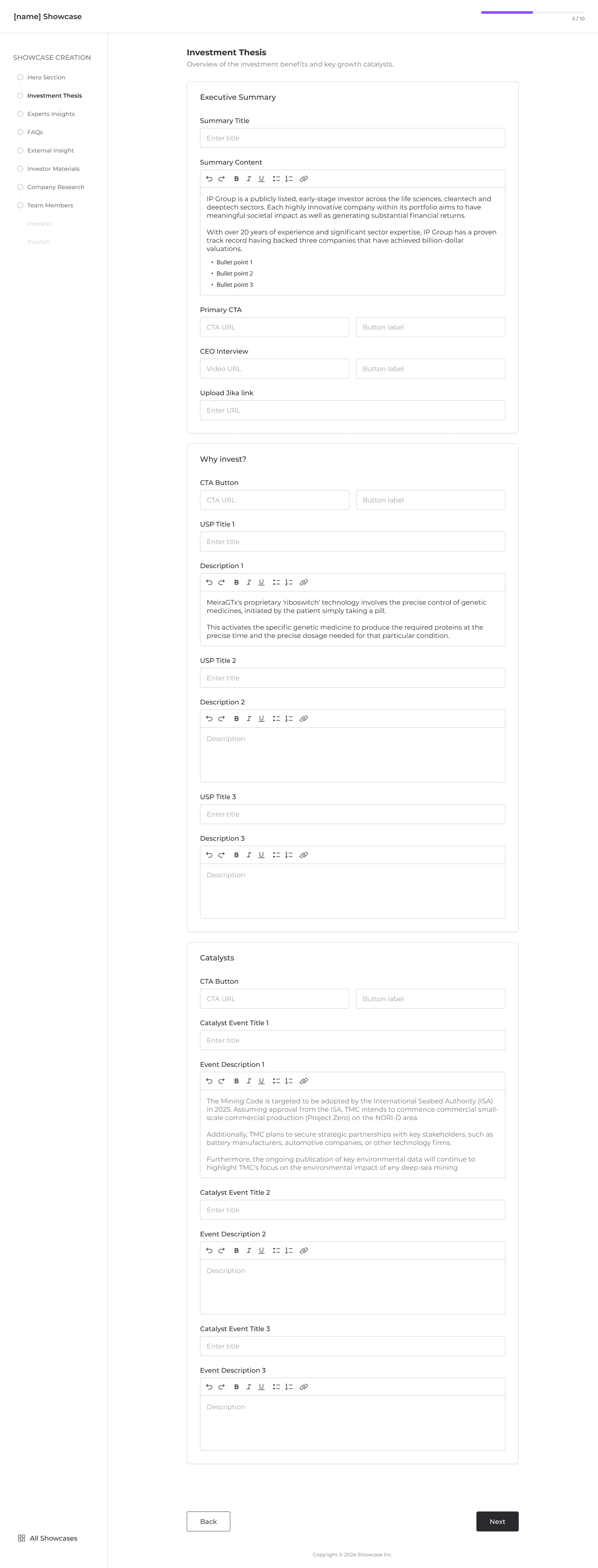
Step 1: Building the CMS
Our first priority was to build a simple but powerful CMS that would allow the Curation Connect team to manage content updates efficiently. This would automate the uploading and editing of client showcases, reducing manual effort and improving workflow speed.
Some of the CMS screens:


Step 2: Redesigning the Showcase Page
Next, we redesigned the showcase page to address user disengagement and trust issues. The new design emphasized:
Reduced Reliance on Video: While video content remained part of the showcase, we reduced its prominence, instead focusing on concise, written content that explained key business information in an accessible manner.
Expert Insights: We introduced a section where external experts and professional investors could share unbiased feedback and market insights, adding credibility to each showcase.
Interactive Elements: The showcase pages became more interactive, featuring infographics, statistics, and concise business summaries to engage users who might not have extensive investment knowledge.
Step 3: Adding Conversion-Driven Features
To further drive engagement and conversions, we implemented several key features:
Pop-Up for Stock News Subscription: After analyzing user behavior, we introduced a pop-up encouraging users to follow the showcased company’s stock news. This led to a 40% increase in conversion rates.
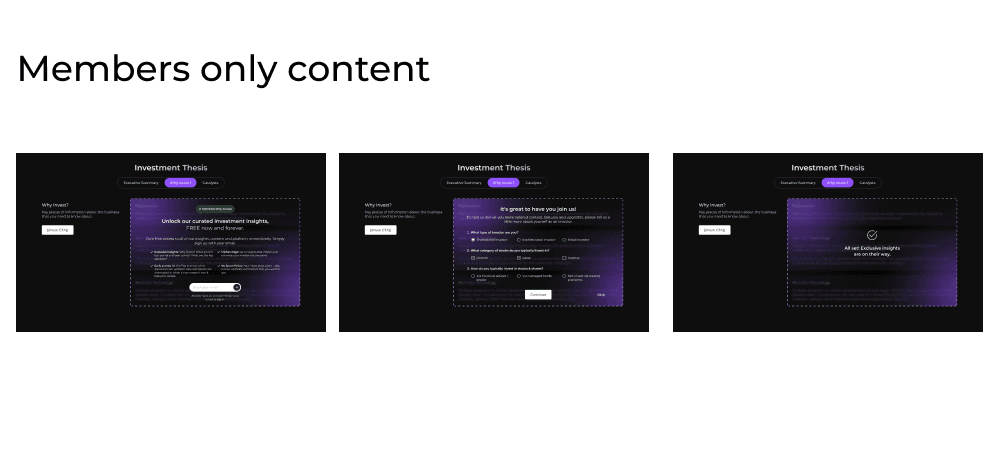
Members-Only Content: We also introduced "members-only" content, where certain high-demand content on the showcase was locked for guest viewers unless they signed up. This resulted in a 30% increase in user sign-ups within just one month.
CTA Banners: Additionally, we introduced clear and strategically placed CTA banners throughout the platform, guiding users toward key actions like signing up, following news, and exploring investment opportunities. This further enhanced conversions across the site.

Step 4: Optimizing the Landing Page
We transformed the landing page from a simple showcase hub to a comprehensive introduction to Curation Connect’s mission. It now highlighted the platform’s purpose, benefits, and success stories, better educating potential users about the value of investing in emerging companies.
Objectives & Key Results
To guide the project, we set clear objectives and key results:
Objective: Empower investors by making key investment information easily accessible and understandable, driving engagement with the Curation Connect platform.
Key Result 1: 60% of users who view a showcase will click on the main CTA (Call to Action).
Key Result 2: Increase the average user time spent on a showcase page by 50%.
Key Result 3: All companies make their own showcase using the CMS
Outcome
The redesigned platform led to significant improvements:
User Engagement: The time spent on each showcase increased by 50%, as users found the content more digestible and informative.
Conversion Rates: 60% of users who viewed a showcase clicked on the main CTA within 6 months.
Content Management: The new CMS allowed the Curation Connect team to create and update 6 showcases in half the time it used to take, streamlining their workflow.
Future Plans
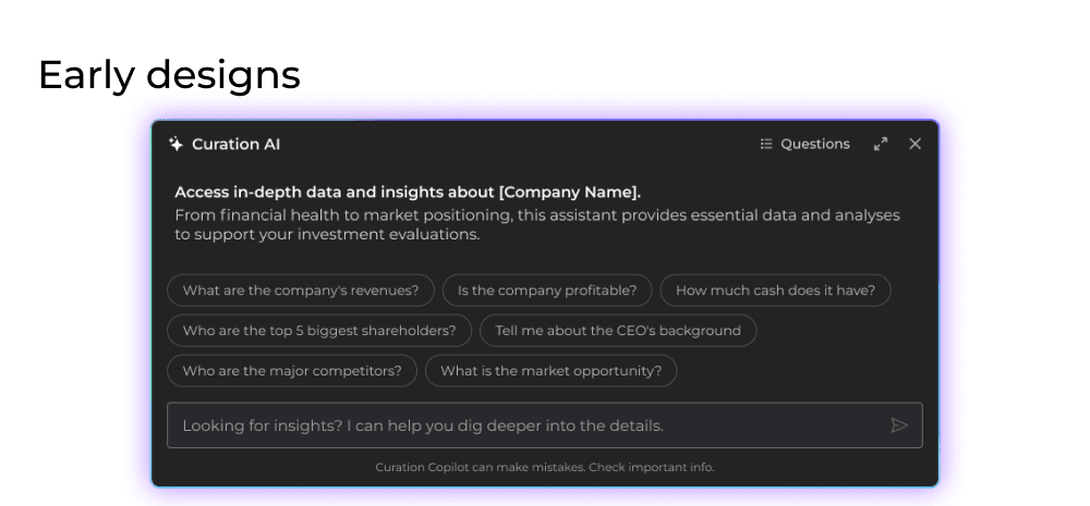
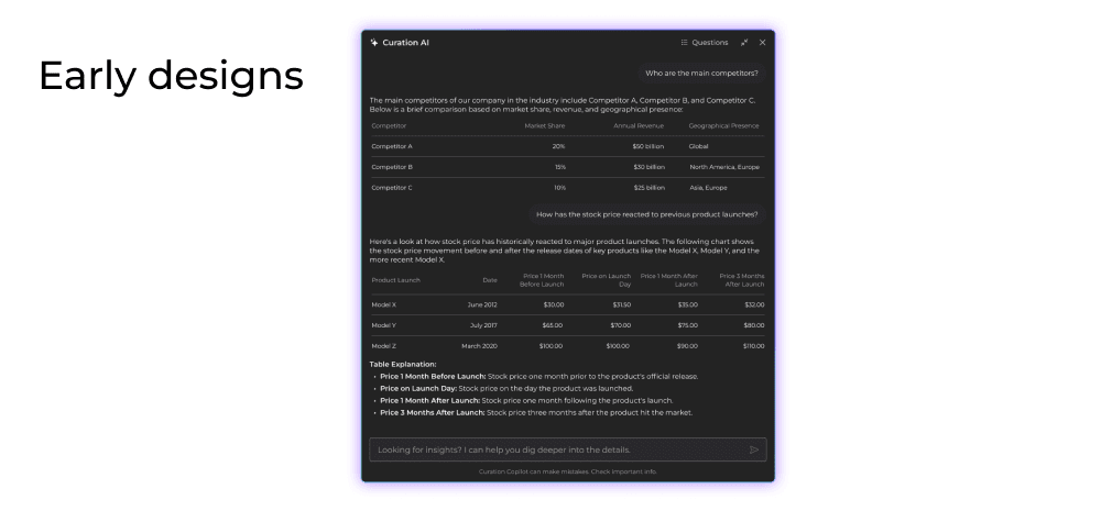
Looking forward, we plan to introduce an AI-powered chatbot to assist investors with real-time questions and clarifications, ensuring they have all the information they need to make confident investment decisions.
Lessons Learned
One of the biggest lessons was the importance of involving users throughout the design process. While holding multiple rounds of interviews and implementing tools like Hotjar required significant time and budget, the insights gained were invaluable in shaping a more user-centered product.
We also learned the importance of balancing speed and quality—delivering solutions quickly, even if not perfect, to iterate and improve later.
Conclusion
This project was one of the most challenging but rewarding experiences in my career.
As the sole designer at the start, I had to work at a fast pace to deliver initial designs, which taught me that delivering something functional early on is key.
Over time, the team grew, and I learned the value of collaboration, working closely with a project manager, co-designer, and the development team to bring the vision to life.
Great design is never done in isolation, and this project reinforced the importance of teamwork in creating successful products.