Control App + Accessibility improvements
We intelligently match angel investors to ambitious high growth SMEs, across all sectors
Company: Angels group
Role: Product Designer
Year: 2023
UX/UI Methodologies & Techniques:
User-Centered Design (UCD)
Personas & User Flows
Design Thinking
Wireframing and Prototyping
Accessibility Guidelines (WCAG)
Context
Introduction
Angels Group approached us with an innovative new phase for their product. Their platform, which intelligently matches angel investors to high-growth SMEs, needed a scalable control application. This new feature would allow Angels Group to resell their product to other businesses, providing them with the tools to manage their own tenants (users or businesses).
The goal was to design a Control App that allowed administrators to easily manage tenants, control branding and domain configurations, and streamline onboarding for resellers
User Research
(Discovery phase)
To kick off the project, we conducted two rounds of research:
Stakeholder Interviews: We interviewed Angels Group’s team and potential resellers to understand their pain points and what functionalities they expected from the control app.
Key Insights:
Resellers needed a user-friendly interface to manage tenants quickly, without deep technical knowledge.
Branding customization was a major priority for resellers—they wanted full control over the tenant’s visual identity.
Most resellers expressed the need for a simple onboarding process for new tenants, where branding and domain information could be added effortlessly.
Competitor Analysis: We reviewed similar platforms that provide multi-tenant management systems, such as KidStart and Flux, Zilch, to understand best practices in tenant creation, branding management, and domain integration.

Key Design Features:
"As a Control App user I want to manage my Tenant users
So that I can setup new environments for my white label clients"
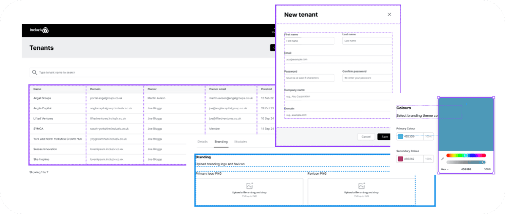
Tenant Management List:
The control app’s homepage features a clean, simple list of all active tenants, showing key information like business name, contact details, and current status.
A search and filter function was included to help administrators quickly find specific tenants or sort by specific criteria, improving overall usability and efficiency.
Tenant Creation Pop-Up:
From the Tenant Management List, users can create a new tenant via a pop-up form, which streamlines the onboarding process.
The pop-up includes the following sections:
Basic Information: Business name, industry, and contact details.
Branding Customization: Fields for adding logos, color schemes, and font selections to match the tenant’s brand identity.
Domain Configuration: Fields to input and configure custom domains, allowing each tenant to have their own branded environment.
Tenant Branding & Domain Management:
Each tenant can configure their own visual branding. We provided live previews of branding updates (colors, logos) as they are made, allowing administrators to ensure the branding is correct before submission.
Domain information is a critical part of the tenant creation process. We designed a simple interface for configuring custom domains for each tenant, helping resellers set up branded environments effortlessly.
Improving Accessibility
Objective:
To enhance the website’s accessibility to meet WCAG 2.1 AA standards, improving the overall user experience for individuals with disabilities. The initial accessibility score was 82%, with the goal of increasing it to 95%.
Accessibility Audit:
Through an initial audit using tools such as Lighthouse and WAVE, we identified several key accessibility issues, particularly related to branding color contrast and font size, which made it difficult for users to navigate the platform effectively. Given that the majority of Angels Group’s user base consists of middle-aged to older individuals, these issues significantly hindered their ability to use the platform easily.
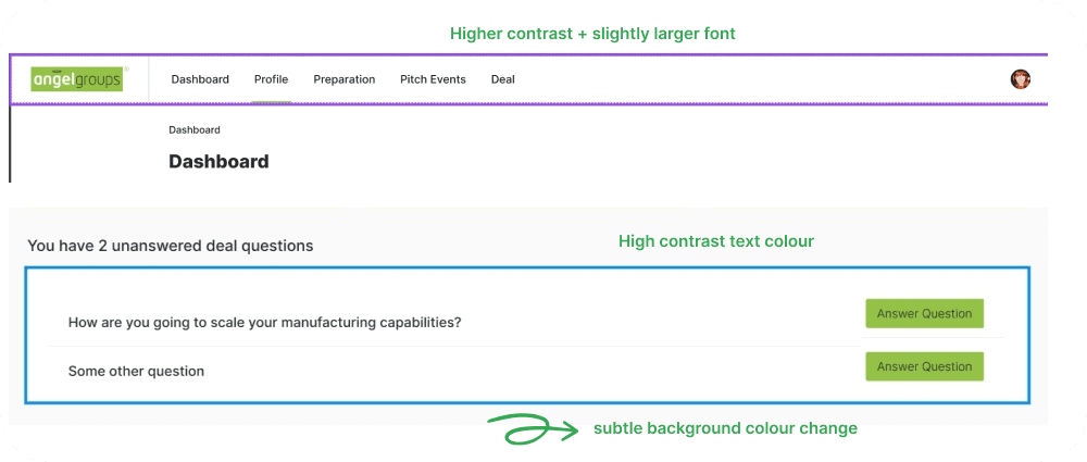
Low Contrast Fonts and Buttons: The branding color scheme resulted in poor contrast ratios, making text and interactive elements difficult to distinguish.
Small Font Sizes: The existing font sizes were too small for many users, especially for the older demographic, making it challenging to read content clearly.
Navigation Issues: Users also struggled with identifying clickable elements due to contrast issues and lack of clear focus states for keyboard navigation.


Design Improvements:
After identifying these issues, we made several impactful design changes:
Font Contrast: The initial contrast ratio was 3.48:1, we adjusted the color palette to ensure that all text and interactive elements met a contrast ratio of at least 7.14:1, in line with WCAG AA guidelines. This was particularly important given the older user demographic, who benefited significantly from improved visibility. This change led to a 15% improvement in navigation and readability during user testing.
Larger Fonts: Font sizes across the site were increased to improve legibility, especially for middle-aged and older users. This made the platform more accessible, resulting in a 10% increase in user satisfaction from this demographic.
Subtle change of background colour
Enhanced Button Text Colors: We refined the button text colors to ensure they stood out more clearly from the background. This change resulted in a 20% reduction in user error rates, as users could now easily identify interactive elements and read clearly.
Outcome
The improvements resulted in the following measurable outcomes:
Final Accessibility Score: Increased from 86% to 96%.
User Interaction: Users spent 25% more time on the site, with a 30% decrease in bounce rate, indicating that the site became more engaging and user-friendly.
Positive Feedback: 92% of users in our post-testing survey found the platform more accessible and easier to navigate, particularly praising the improved contrast and font sizes.
Learnings
We learned that addressing issues with branding color contrast and font sizes is especially important for platforms with an older user base. Continuous user testing with real users, including those with disabilities, was essential for identifying and fixing pain points that might not be obvious in initial audits.